
Project Background
This case study demonstrates how we improved Doctap's online doctor appointment booking experience for busy professionals seeking quick and convenient same-day doctor consultations. By streamlining the booking process, introducing AI chatbot assistance, and providing transparent doctor choices, we successfully increased booking rates and user satisfaction.
Role
- User Research
- Product Strategy
- UI Design
- Interaction Design
- Usability Testing
Tools
- Notion
- Figjam
- Maze
- Figma
Timeline
- 4 Weeks
The Problem
Doctap's current interface poses navigation challenges, restricts users to predefined issues, and lacks transparency in providing comprehensive background information and reviews for available doctors. The business aims to elevate booking rates by delivering a seamless, efficient, and user-centric experience.
The Solution
We addressed these needs comprehensively by introducing an AI chatbot-driven streamlined booking process that empowers users to personally describe their symptoms and select their location. The new system allows flexible appointment scheduling beyond just same-day options. Additionally, we enhance transparency and user choice by providing in-depth doctor profiles, including backgrounds, interests, and patient reviews, along with the ability to view doctors' full calendars for more appointment options. We enriched the experience further by adding appointment reminder opt-ins via email or text, integration with Apple or Google calendars, and quick payment options including Apple and Google Pay for a seamless checkout process.

Generative Research
We began our case study by crafting a script for qualitative research interviews, laying the foundation for our investigation. Through interactions with 7 users, we dived into their online doctor booking experiences, keeping their narratives central throughout. This approach ensured that our design decisions were driven by user insights, aligning user needs with business objectives at each phase of the design process.

Synthesis
To really get into the heart of our user interviews, we turned to ChatGPT for assistance. Zoom transcriptions in hand, we tapped into ChatGPT to uncover the recurring themes, patterns, and user pain points. This dynamic process made organizing our data within FigJam a breeze, boosting our efficiency.

Business & User frustrations
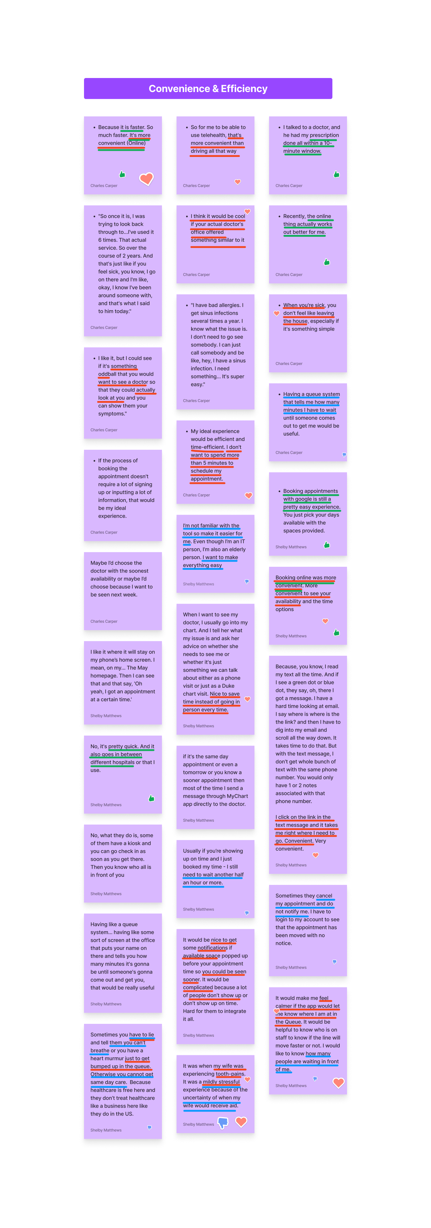
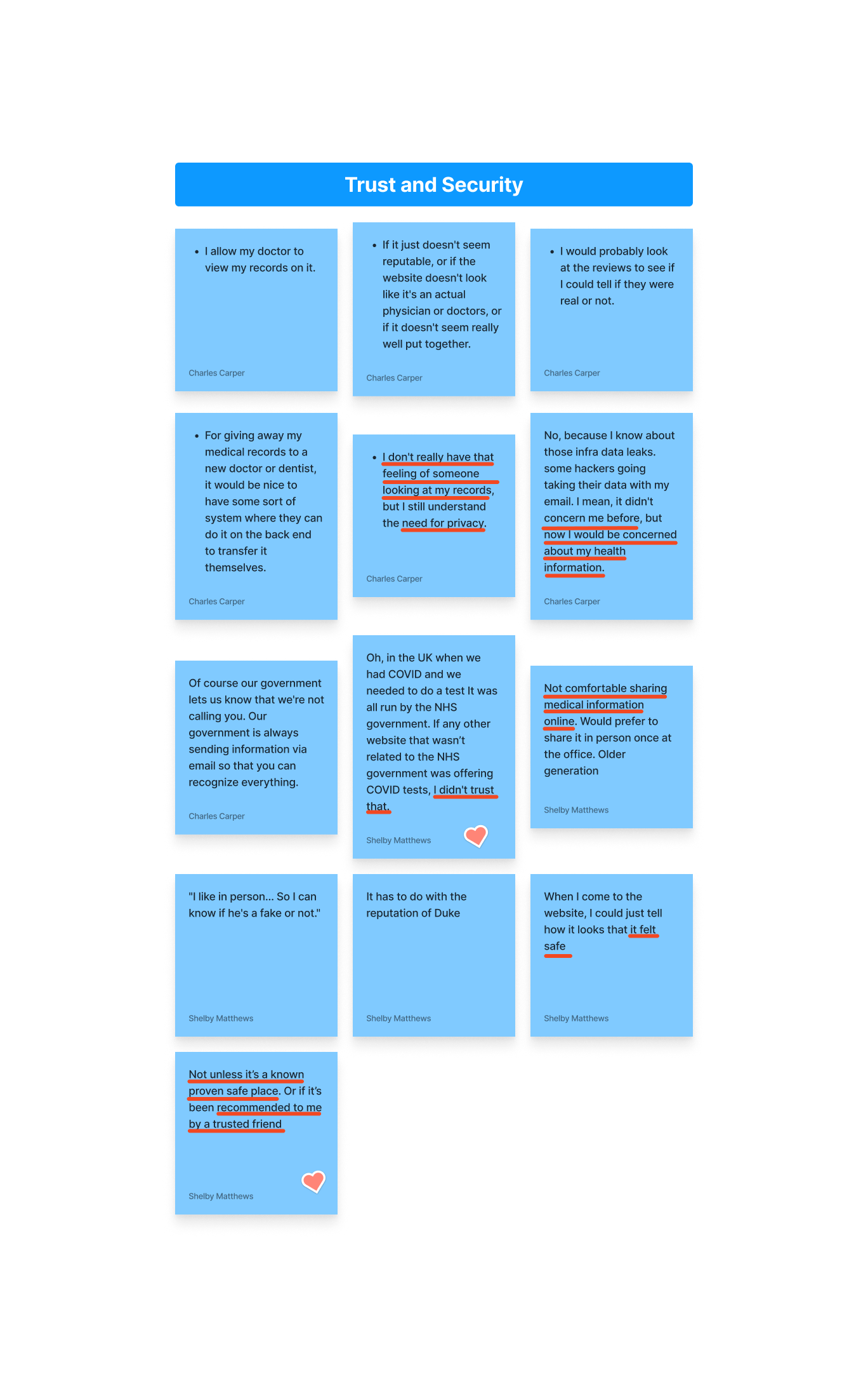
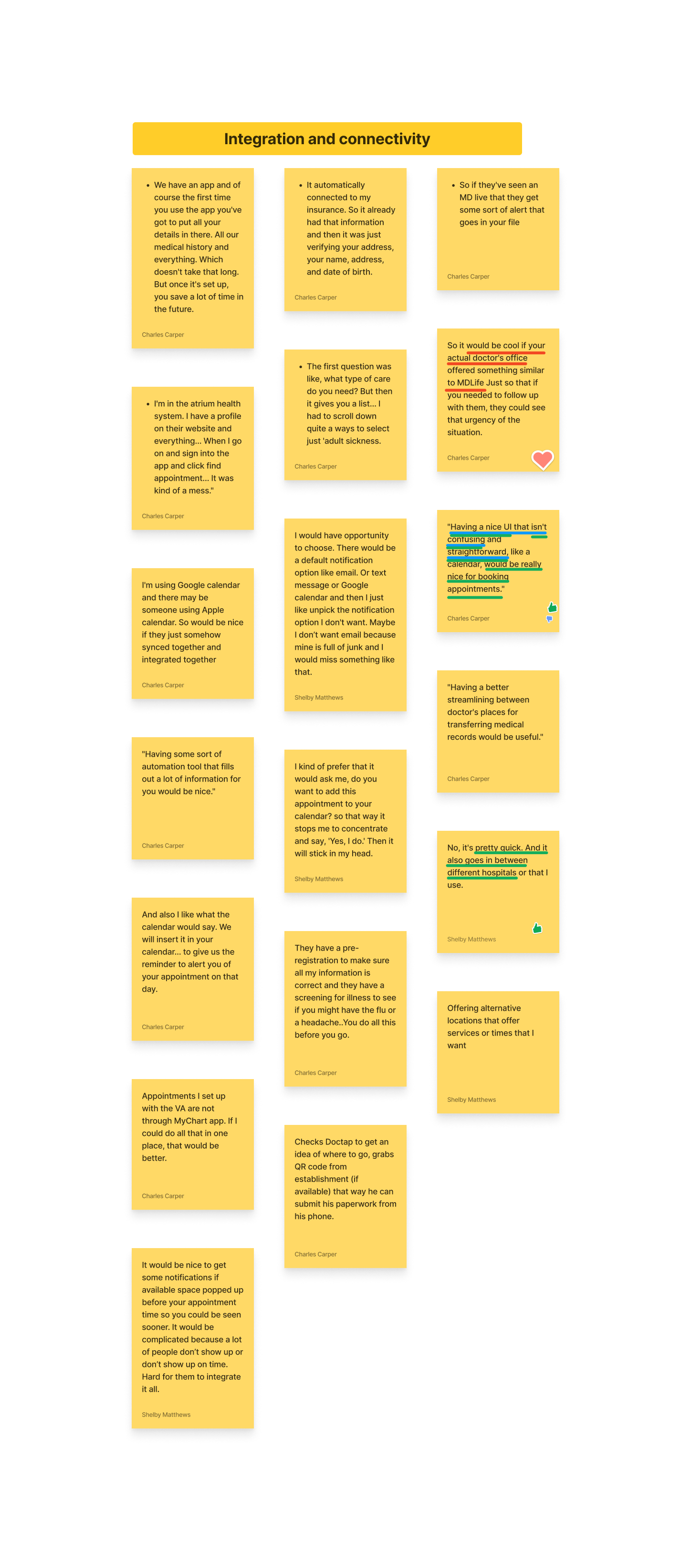
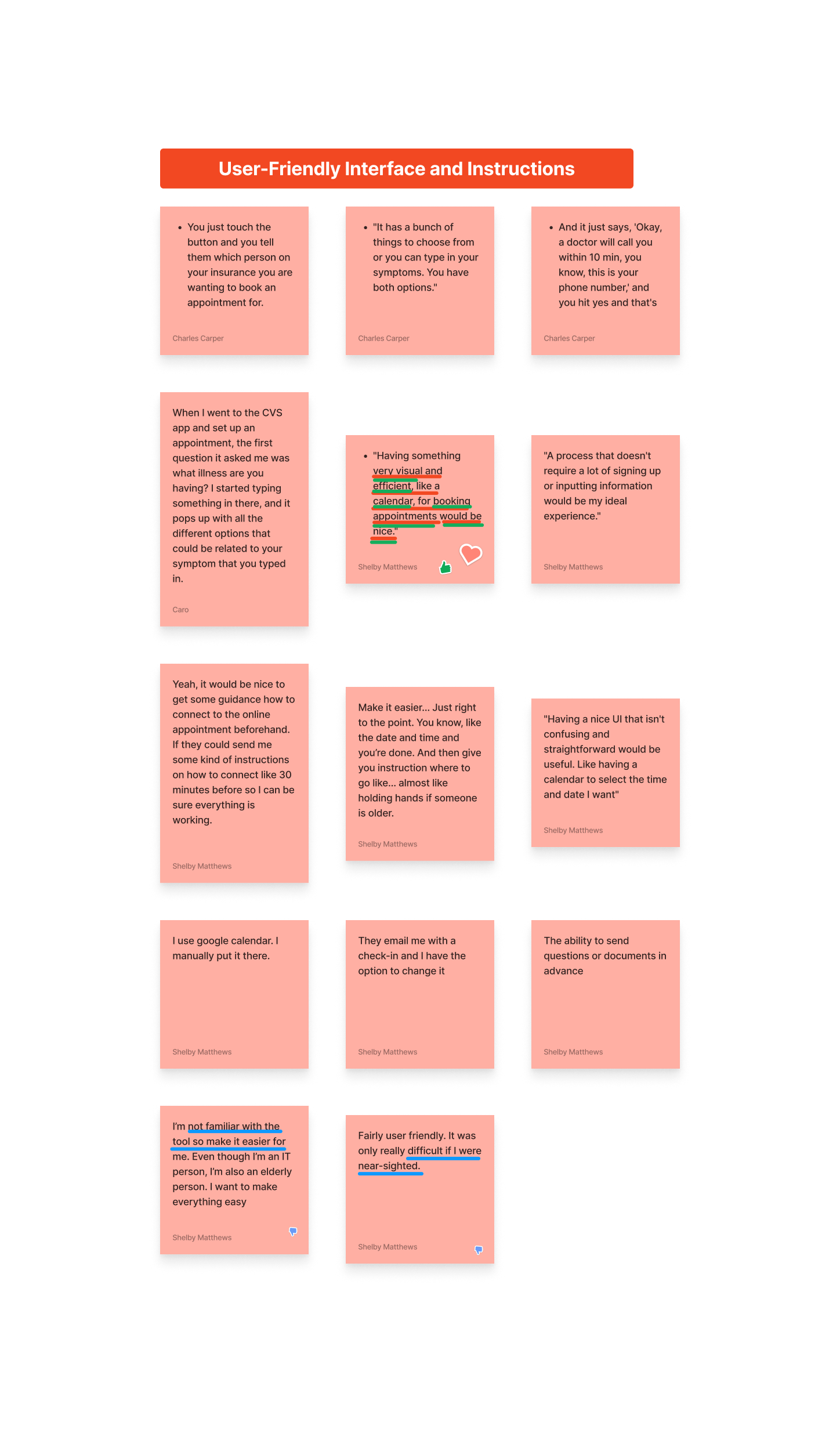
In examining challenges encountered by both users and the business, our synthesis zeroed in on critical pain points. Users expressed frustrations about time-consuming appointment bookings, excessive selections, privacy issues with medical history sharing, the necessity for calendar integration, limited health information access, unclear post-booking instructions, desire for text or email reminders, transparency in wait times, difficulties in doctor research, and inadequate doctor background information. Guided by these insights and aligned with business objectives, our design approach addressed these issues comprehensively.
Primary Frustration
When seeking immediate same-day appointments, users demand a swift and straightforward online booking process to cater to their current needs and encourage future platform usage. Otherwise, the complexity of the booking experience could deter users from returning and addressing their immediate appointment requirements, posing a challenge for both user engagement and business success.
Secondary Frustration
When appointments are successfully booked, users expect clear post-appointment instructions, appointment reminders, and visibility into wait times. The lack of these aspects could deter users from revisiting the platform for any of their online doctor booking needs, impacting both user retention and overall business performance. Ensuring a positive post-booking experience becomes pivotal in encouraging sustained user engagement.
Competitor Benchmarking
We conducted competitor benchmarking by studying an indirect competitor, a barber shop, which employs Square for a streamlined online booking process. This experience influenced our design choices, inspiring us to create a similarly quick and user-friendly doctor booking platform.
Problem Space
Users seeking immediate same-day doctor appointments are hindered by the complex and time-consuming online booking process, potentially discouraging platform usage for both urgent and non-urgent healthcare needs. Additionally, users lack clear post-appointment instructions and insights into wait times, negatively impacting user retention and overall platform effectiveness.
How might we streamline the online doctor booking process to provide a quick and user-centric experience, catering to users' immediate and non-urgent appointment requirements, while also ensuring transparent post-appointment instructions and wait time insights to encourage consistent platform utilization?
Ideation
We embarked on a structured ideation process, commencing with the creation of a user journey map for the current Doctap booking flow. Leveraging insights learned from user interviews, this exercise illuminated the range of emotions users encounter within the existing process. By identifying these emotional touchpoints, we pinpointed precise areas for enhancement during each stage of the booking flow, enabling us to develop targeted solutions for a more user-centric experience.
What can we add
The most impactful innovation we identified for integration into the Doctap platform is the implementation of a chatbot AI. This strategic addition enhances user interaction by providing a personalized avenue for explaining symptoms and concerns, thus surpassing the constraints of pre-defined choices. Moreover, it expedites the booking process, aligning seamlessly with the users' and businesses' desire for swift and convenient appointment scheduling. Furthermore, the addition of the Chatbot offers an additional layer of value by transparently providing post-appointment follow-up information. This empowers users to be well-informed about their next steps, facilitated by the checkbox opt-ins selected during checkout.
What can we improve
The most crucial enhancement we pinpointed for the Doctap platform is the improvement of doctor background information, reviews, and availability. By enriching this aspect, we empower users to make well-informed decisions without needing to leave the platform for external research. This upgrade aligns seamlessly with the user's need for transparency and trust, streamlining their decision-making process while ensuring they remain engaged within the Doctap ecosystem.
User Flows
We orchestrated an in-depth analysis of both existing and enhanced user flows within FigJam. Starting with outlining the current user journey, we adeptly identified opportunities to seamlessly integrate the innovative solutions we conceived during the ideation phase. This strategic process served as a guiding compass, allowing us to pinpoint precise junctures for implementing our additions and improvements, effectively ensuring a streamlined and user-centric experience.
Rapid Prototyping
Then we translated the enhanced user flow we outlined previously into tangible wireframes. These wireframes served as a direct embodiment of our refined user journey, paving the way for our next phase: transforming these designs into a high-fidelity prototype.
Styles and Components
We meticulously curated the color palette, text styles, and UI components for our high-fidelity prototype. While staying true to the familiar Doctap platform, we introduced a complementary secondary color to invigorate the design. Our components are a direct extension of the low-fidelity wireframes and the inventive ideas we cultivated for implementing enhancements and additions.
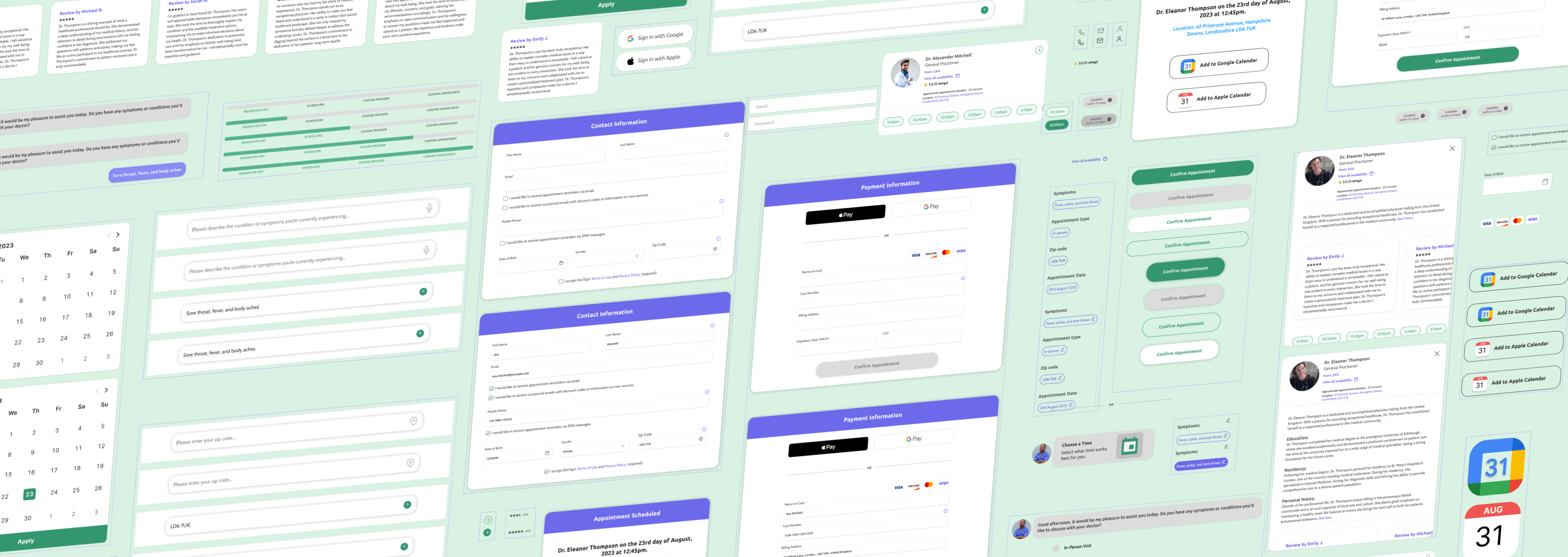
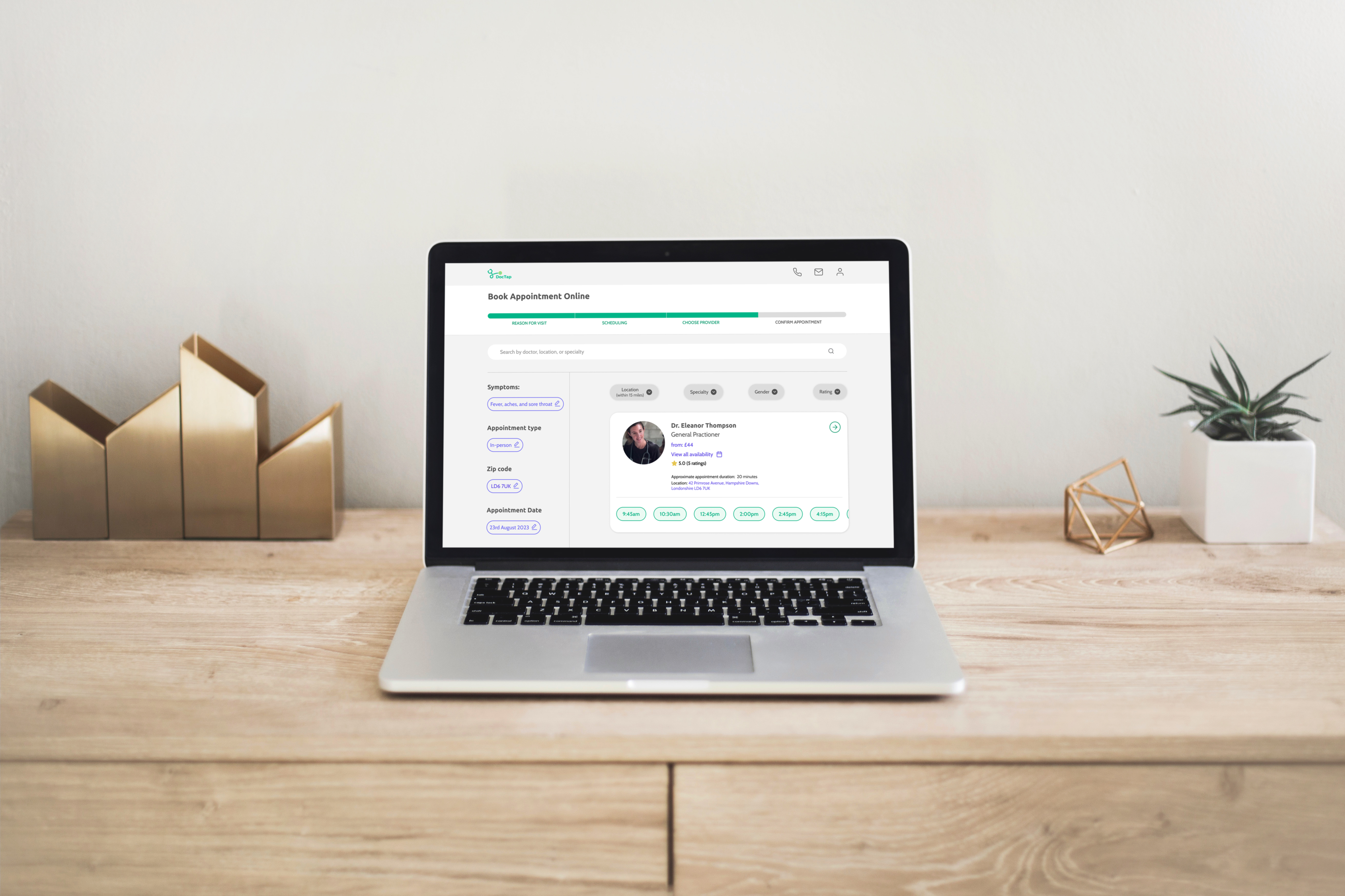
Hi-fidelity Prototype
We brought our vision to life with a comprehensive high-fidelity prototype. This dynamic prototype showcases the full spectrum of enhancements and additions we conceived throughout our design process, resulting in a streamlined and user-friendly experience. Through this prototype, users can tangibly interact with the simplified user flow that embodies our innovative ideas, providing a tangible preview of the improved Doctap platform.
Usability test
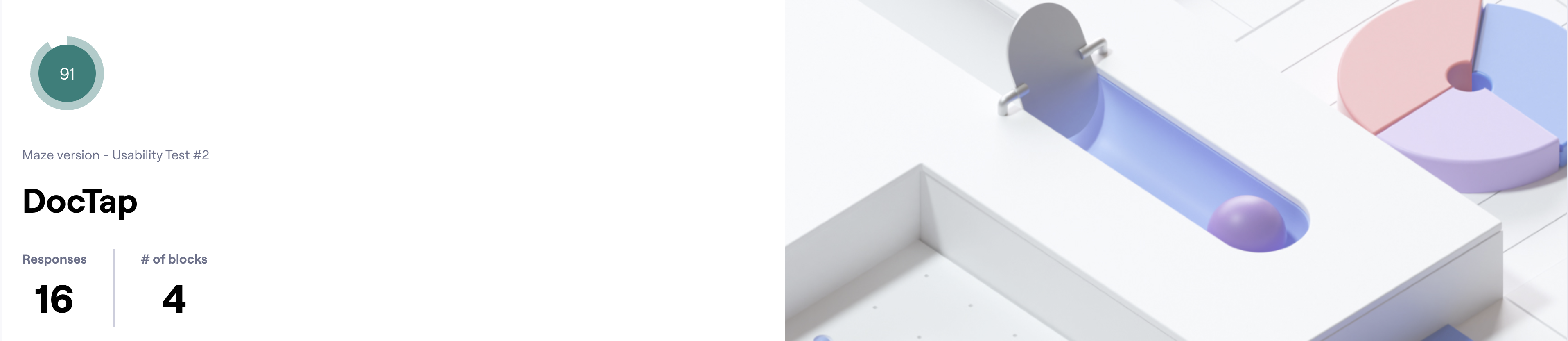
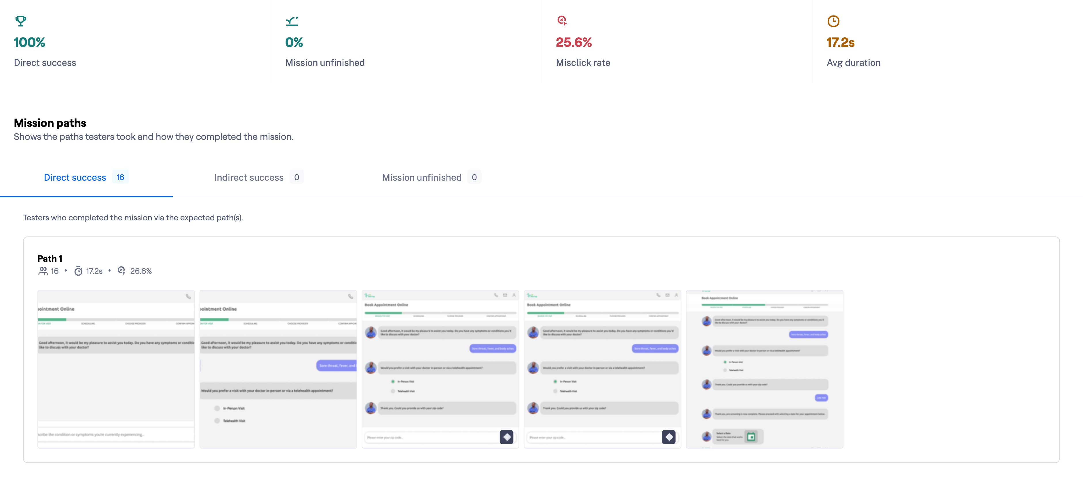
We developed a comprehensive usability testing script tailored for integration with the online testing platform, Maze. This enabled us to assess the effectiveness of our optimized booking flow, measuring its simplicity and speed. Additionally, we gauged overall user satisfaction, exploring the likelihood of users returning to the app for future appointments. This rigorous testing approach allowed us to validate our solutions and ensure alignment with both user and business requirements, resulting in a robust design iteration process.

.jpg)
Test Outcomes
Having tested the prototype, we learned that by offering simplified and transparent choices to users, we can alleviate their sense of being overwhelmed during the booking process. This improvement should contribute to our business goal of enhancing user engagement and return usage. Users are seeking swift solutions, especially when unwell, and ensuring a seamless experience from the outset through the entire post-booking phase keeps Doctap as their top choice for seeking medical attention. This benefits both users by providing convenience and the business by fostering brand loyalty and sustained platform utilization.
Three key learnings
- User-Centricity Through Interviews:The case study underscored the value of user interviews in maintaining user-centricity throughout the design process. By continuously referencing user stories, we remained grounded in the user's perspective, ensuring alignment with both user needs and business objectives. This approach kept the "why" behind every decision at the forefront, fostering confidence in design choices and resulting in a more impactful solution.
- Personalized AI Interactions: The case study highlighted the power of AI in providing a more personalized user experience by simulating human interactions. The implementation of an AI chatbot allowed for a tailored interaction that reduced user overwhelm by striking the right balance between options. This insight underscores the importance of empathetic design even in AI-driven solutions, as it can positively impact user emotions and overall engagement.
- Holistic User Experience: A crucial takeaway is the need to consider the user journey from start to finish, encompassing all touchpoints – from initial awareness to post-interaction stages. Understanding that a user's experience extends beyond direct product interaction is essential for crafting a comprehensive solution that meets user needs across various phases. This holistic approach ensures better user retention and sustainable business growth.
Next Steps
If time allowed for further iteration, we would have focused on refining the user experience by introducing a user dashboard after booking their appointment. This dashboard would enable users to conveniently store their health history, pharmacy preferences, and even mark preferred providers they've consulted in the past. This addition aligns seamlessly with our business objective of enhancing user retention while expediting future bookings and check-ins. By offering users a hub of personalized information, we would not only bolster convenience but also provide a higher level of transparency, thereby enriching their overall experience with the platform.