Project Background
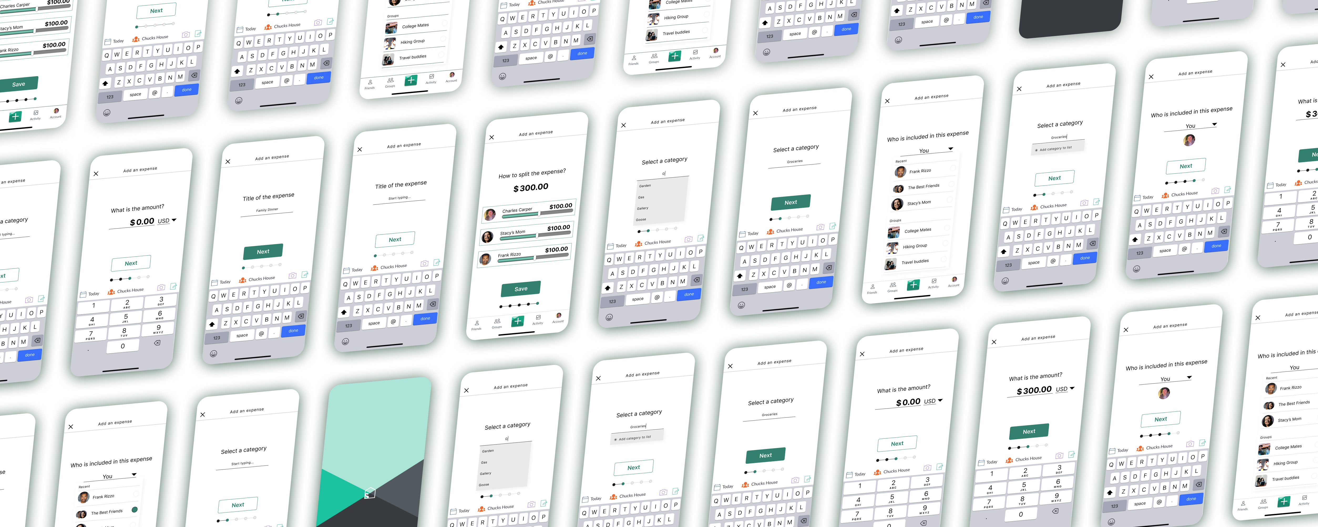
In this case study, we aim to enhance the user experience of Splitwise, an expense-sharing app, by implementing intuitive and transparent features for expense categorization and payment tracking. Our goal is to increase adoption of the paid product, fostering trust and accountability among users, leading to higher conversion rates and sustained business growth.
Role
- User Research
- Product Strategy
- UI Design
- Interaction Design
- Usability Testing
Tools
- Notion
- Figjam
- Maze
- Figma
- Dovetail
- Google Forms
Timeline
- 10 weeks
The Problem
Roommates with shared expenses need a solution to track payments and make sure everyone pays what they owe. Without a central system to categorize and track expenses the outcome is financial and relationship strain, leading to unpleasant arguments.
The Solution
optimize the expense creation process by simplifying the category selection through the removal of unnecessary images and introducing a clear process bar for better user guidance. By prioritizing the most valuable enhancements, we aim to streamline the user experience and improve overall efficiency, ultimately increasing user satisfaction and engagement with Splitwise.
Generative Research
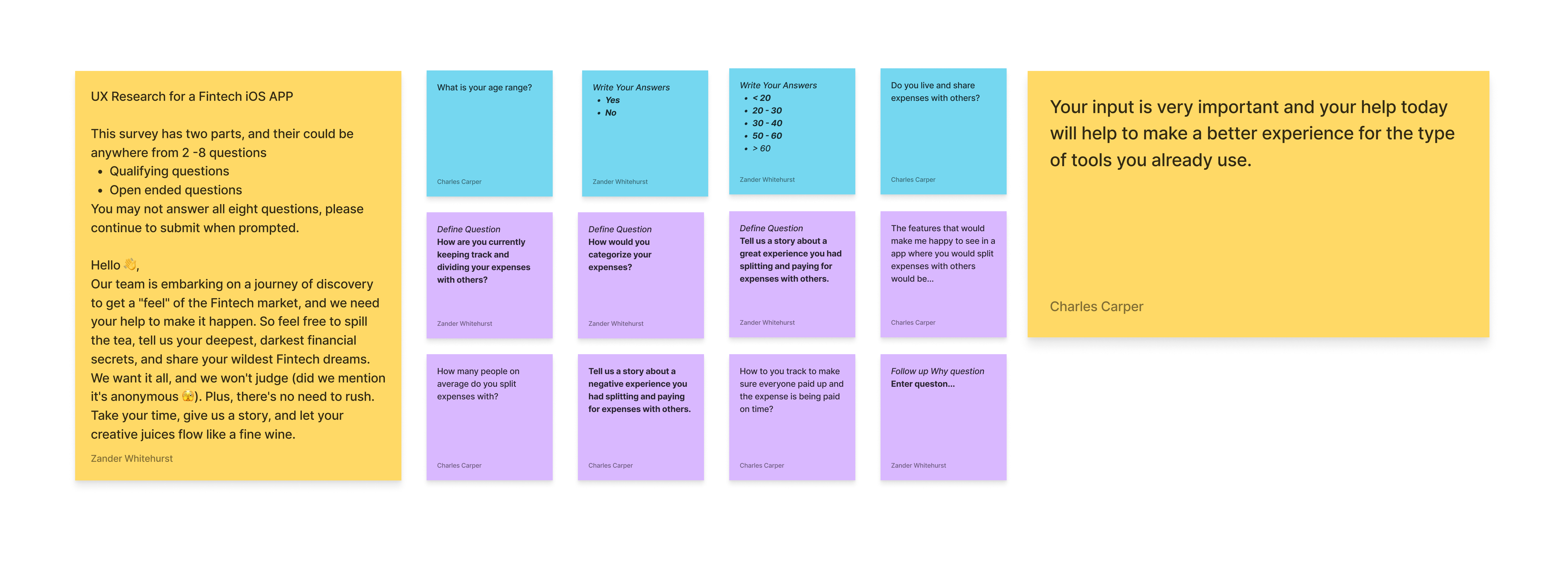
I conducted a qualitative research survey using a Google Form to explore the pain points of users using split expense apps, with a focus on Splitwise. The survey included both open and closed questions to gather comprehensive insights, enabling the identification of common challenges and providing valuable data for potential enhancements.
Synthesis in Dovetail
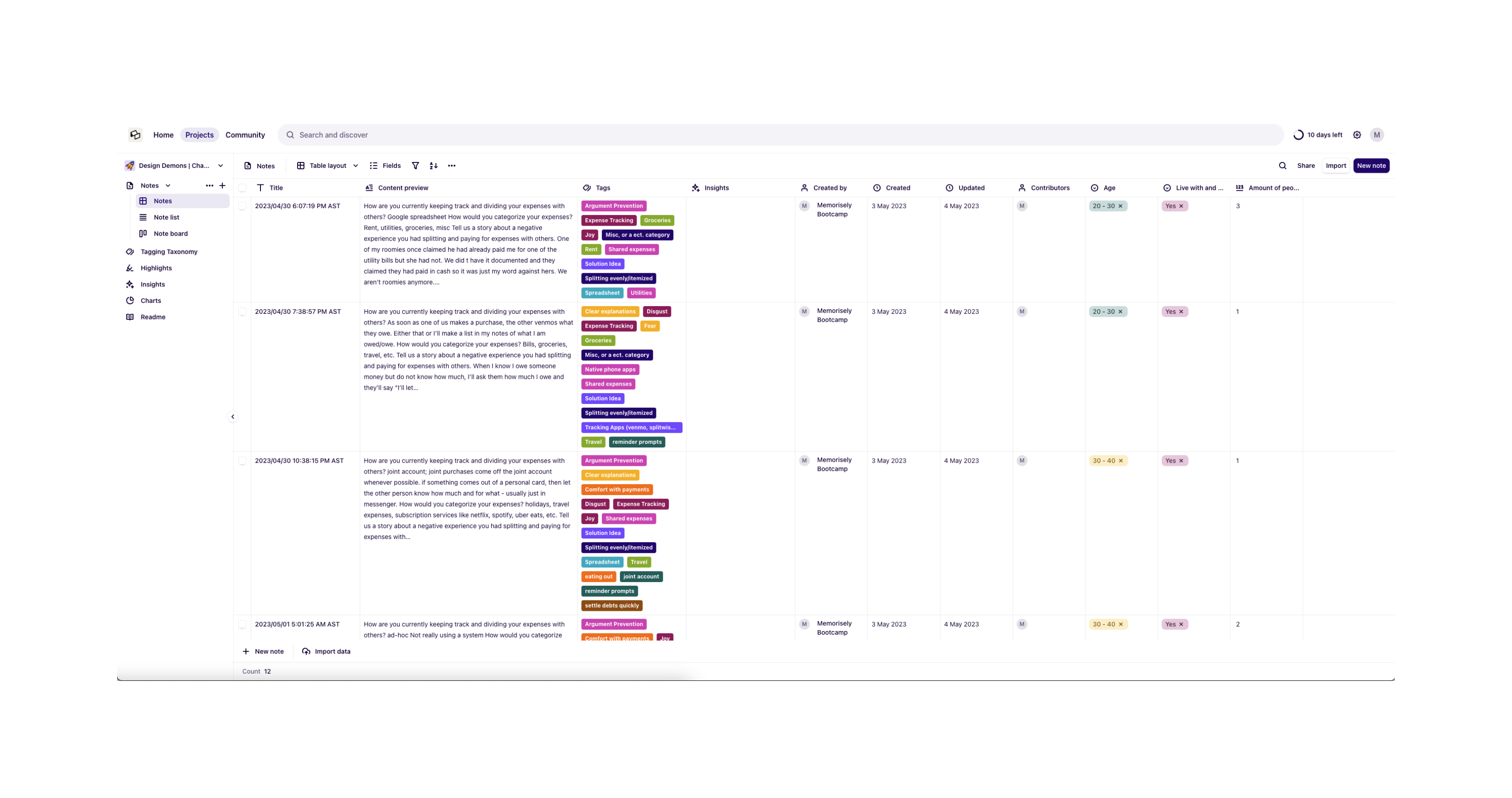
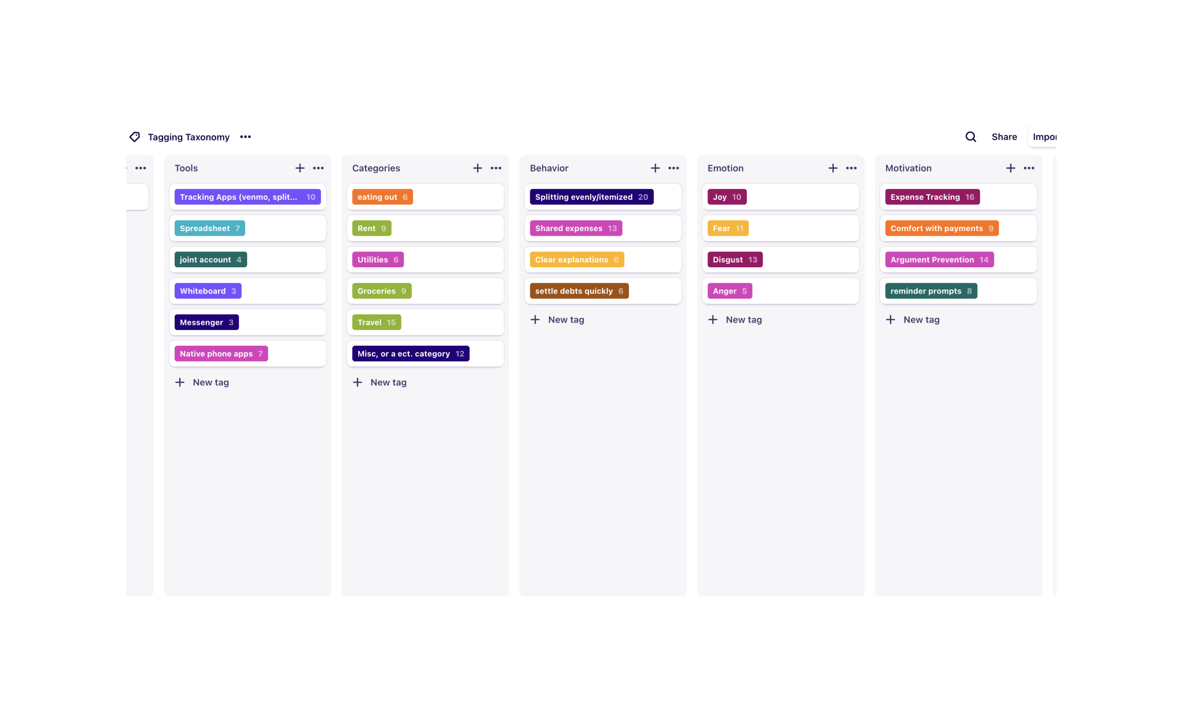
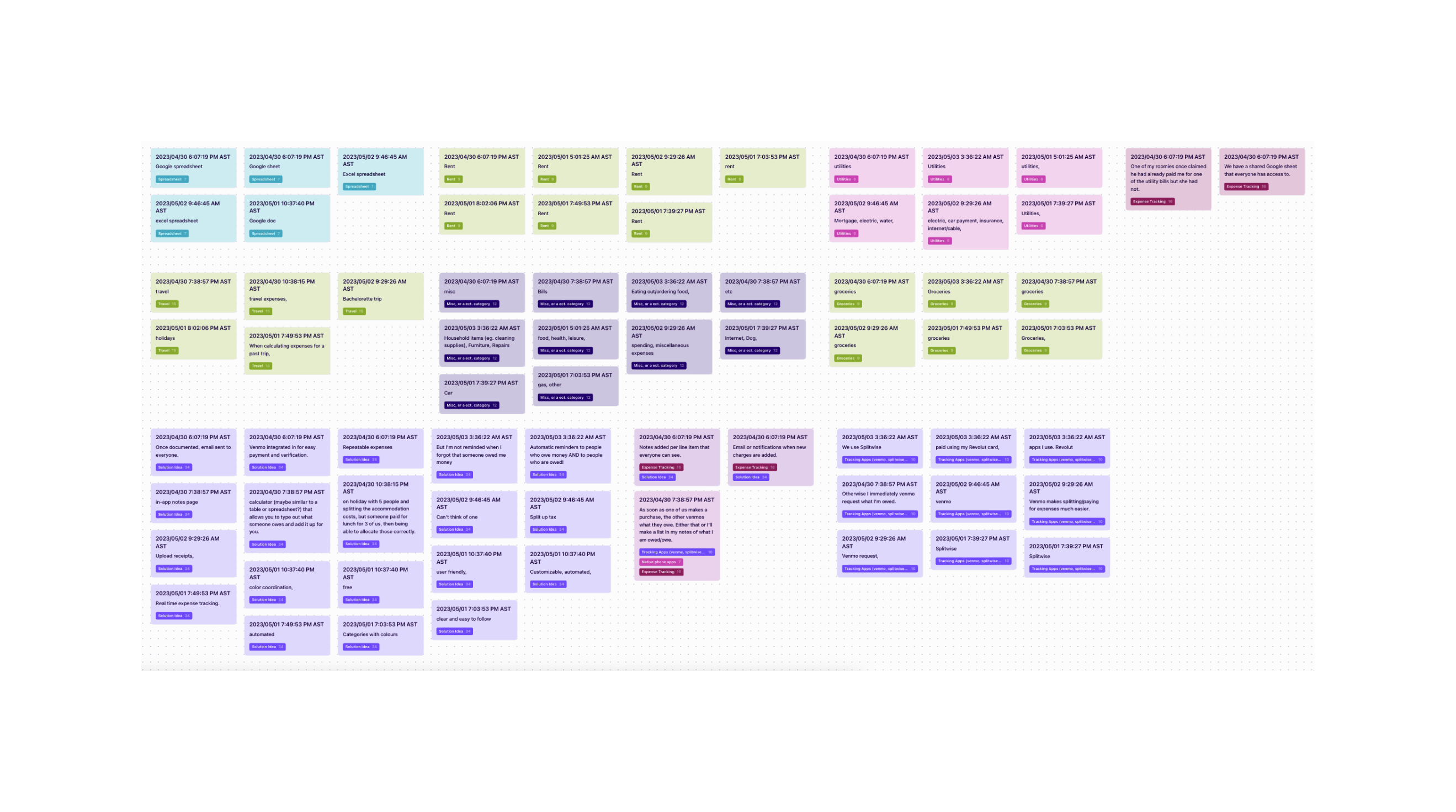
I utilized Dovetail, a synthesis tool, to import and tag all the raw data obtained from the qualitative research survey. By employing this tool, I aimed to efficiently sort and analyze the data, creating an affinity map that uncovers users' pain points, needs, and desires, enabling better understanding and actionable insights for addressing their concerns.
Benchmarking
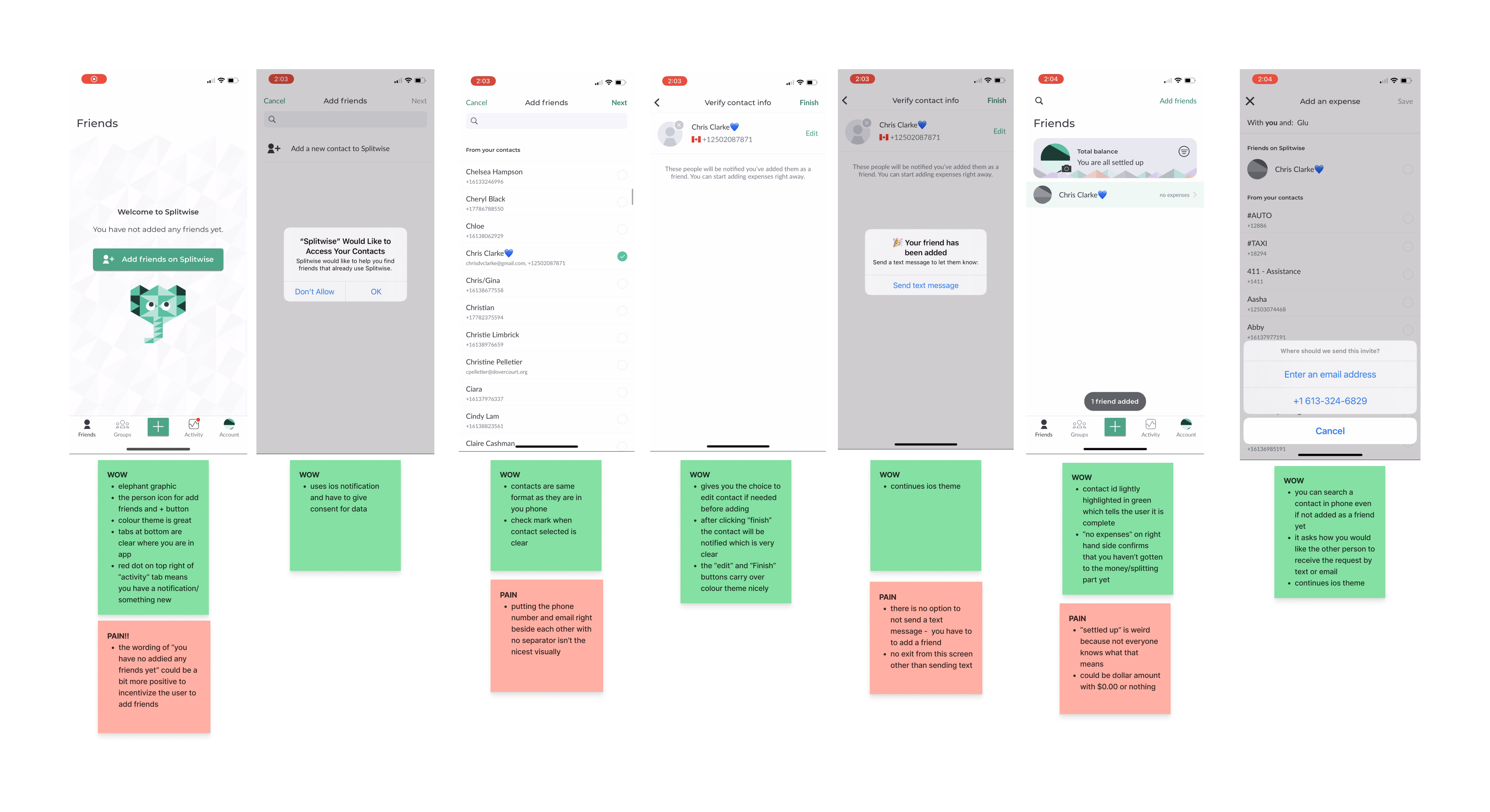
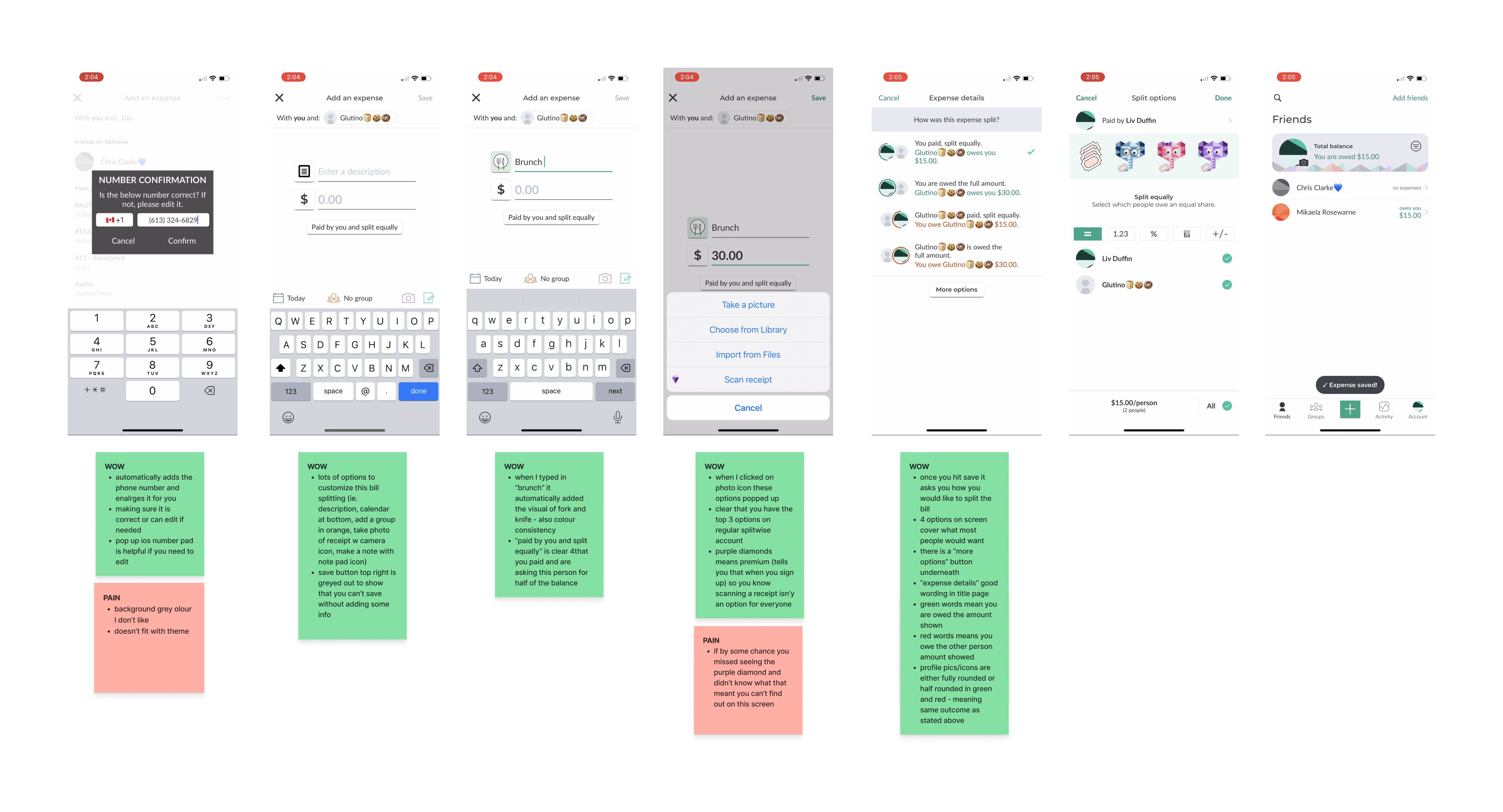
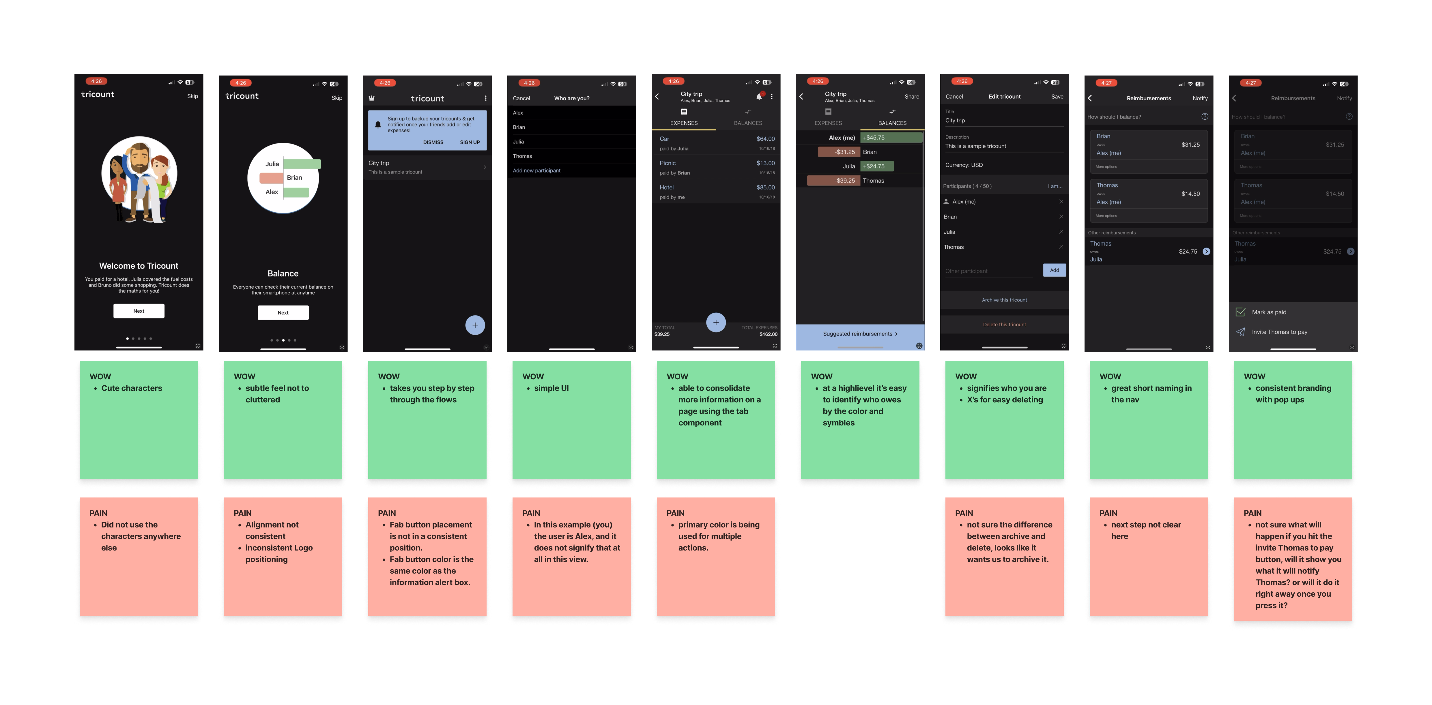
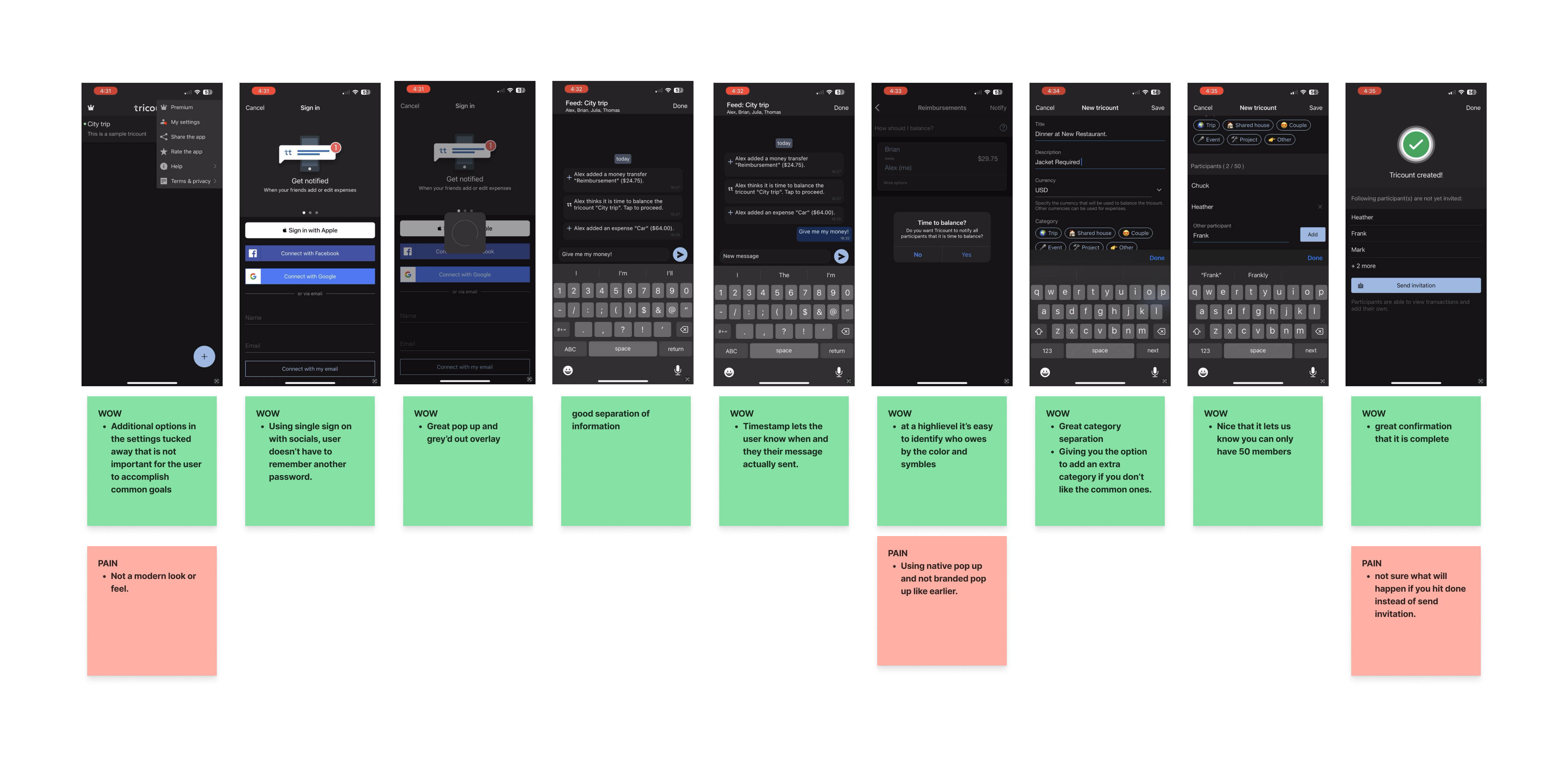
I performed a competitive analysis, comparing Splitwise's current offerings to industry benchmarks. This allowed me to identify areas of improvement, understand best practices, and gain insights to enhance the user experience and stay competitive in the market.
Ideation
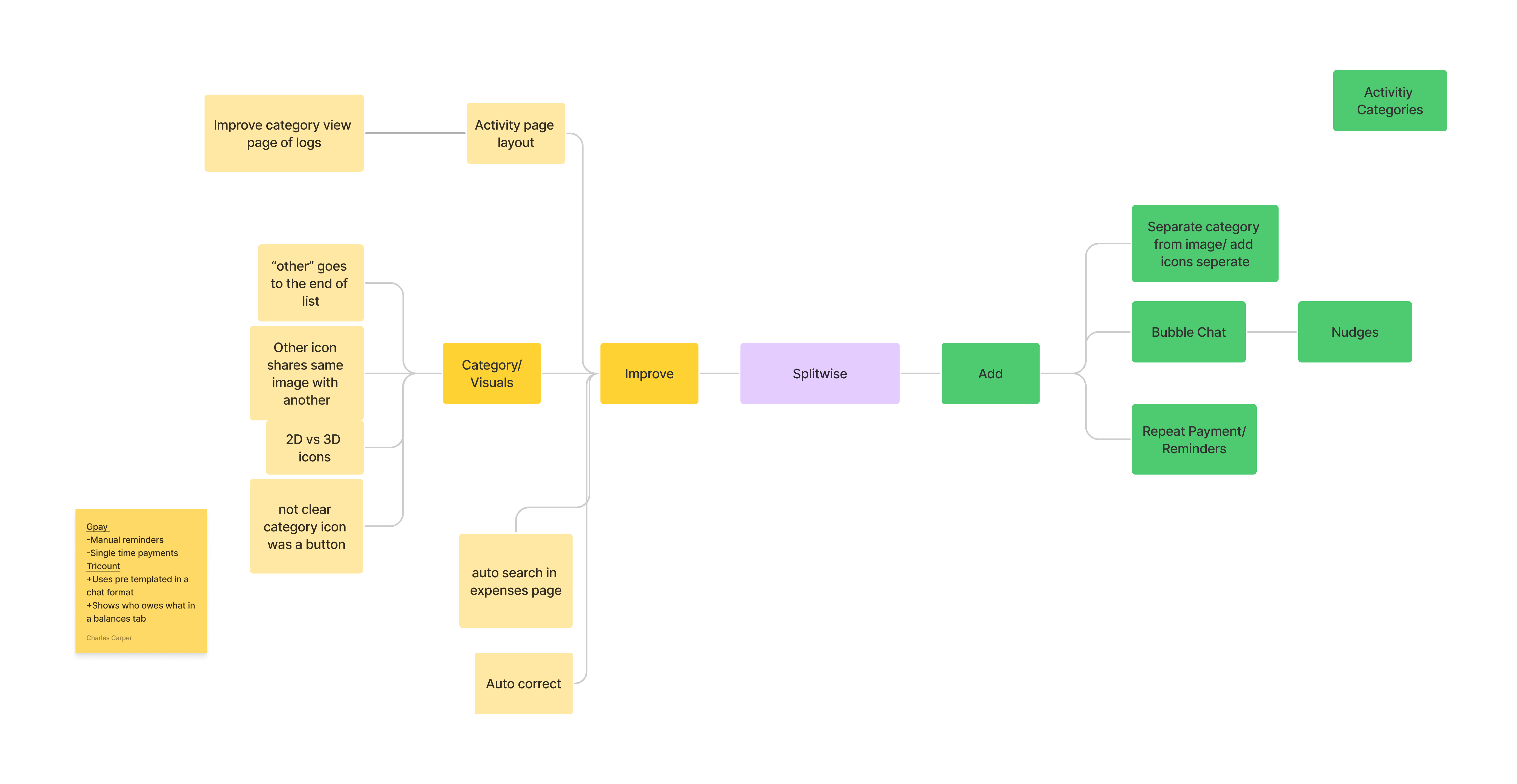
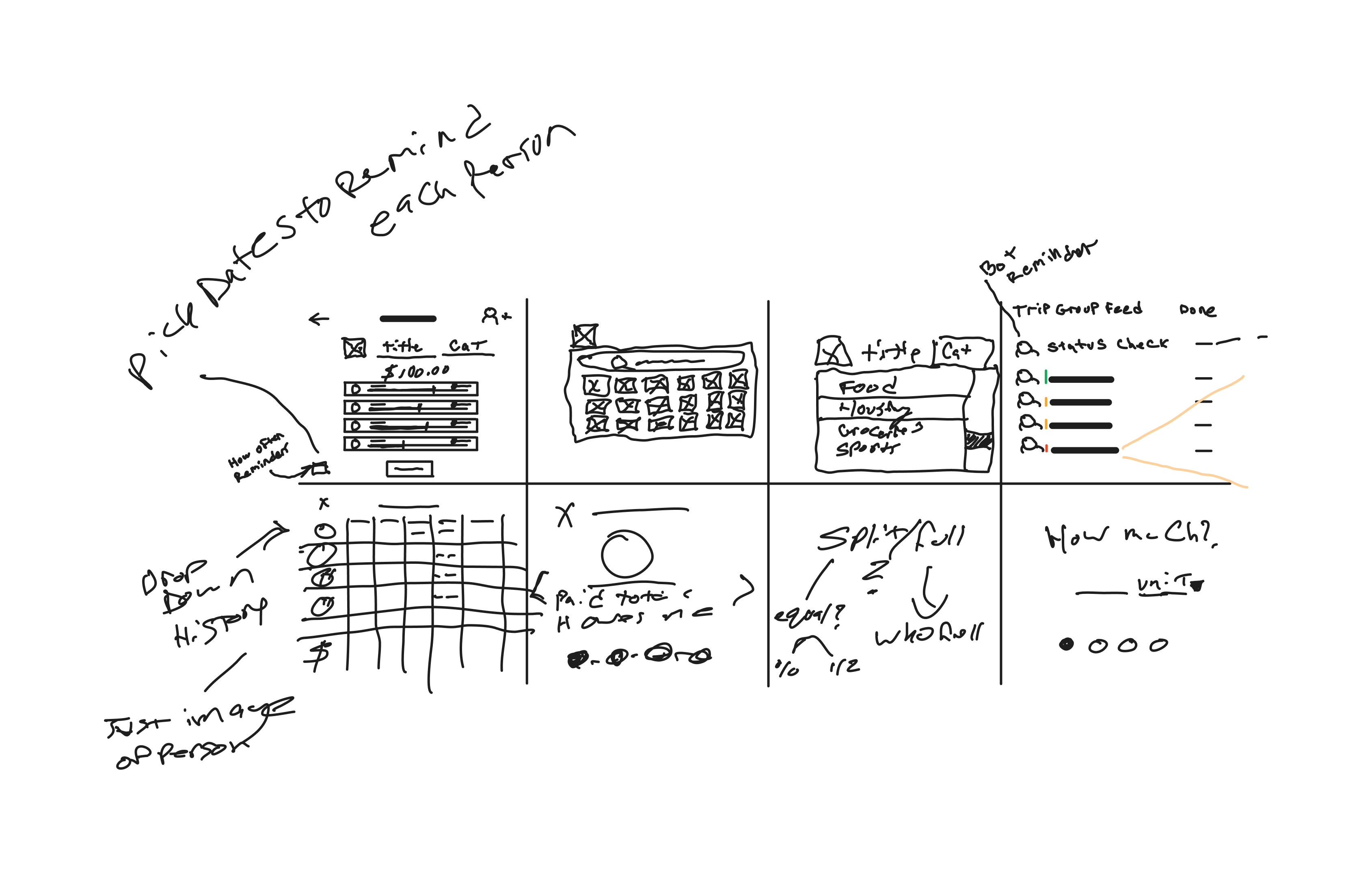
In the ideation phase of UX design, various techniques were employed, including mind mapping to identify areas of improvement and potential new features. Additionally, Crazy 8's was used to generate unconstrained ideas, which were then evaluated through an effort and value matrix to determine the most valuable and feasible solutions for enhancing the user experience.
Information Architecture
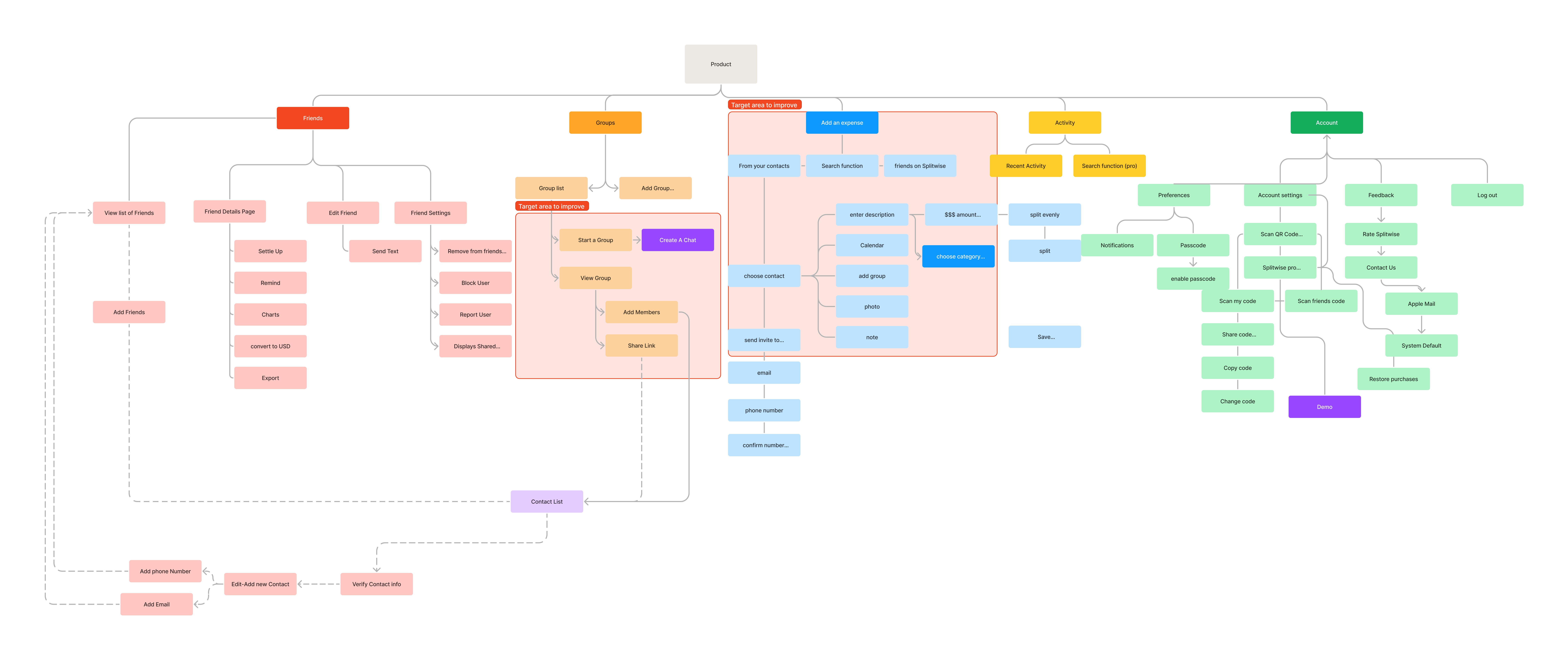
The process of information architecture helps in assessing whether the hierarchy and structure of a system can be modified to enhance the overall user experience. By evaluating the organization and arrangement of information, it aims to identify opportunities for improvements that lead to a more intuitive and user-friendly design.
Rapid Ideation
I developed both the existing and improved user flow tasks to gain a high-level understanding of the required screens and identify opportunities for streamlining the process. This exercise allowed me to visualize the user journey, facilitating the ideation process and potential simplification of the overall user experience.


Lo-fidelity wireframes
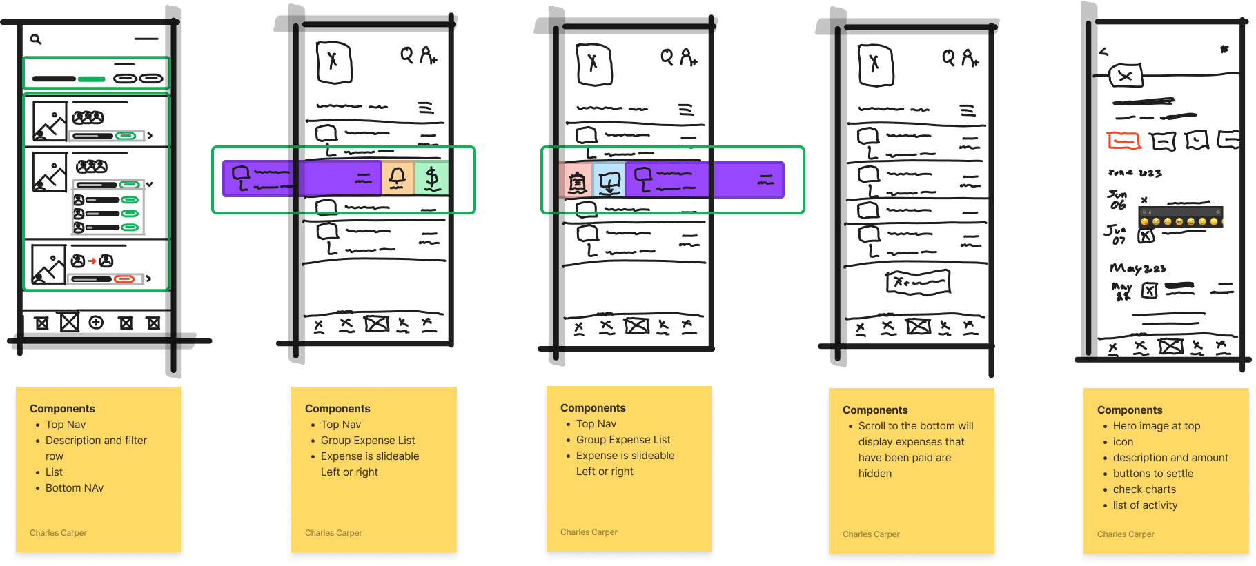
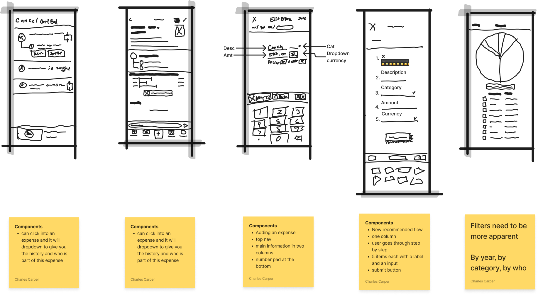
After finalizing the improved user flow, I proceeded to create low-fidelity wireframes for each screen. This allowed me to visualize the application's structure at a component level, akin to assembling lego blocks, providing a high-level overview and aiding in the evaluation of the design's coherence and functionality.
Styles and Components
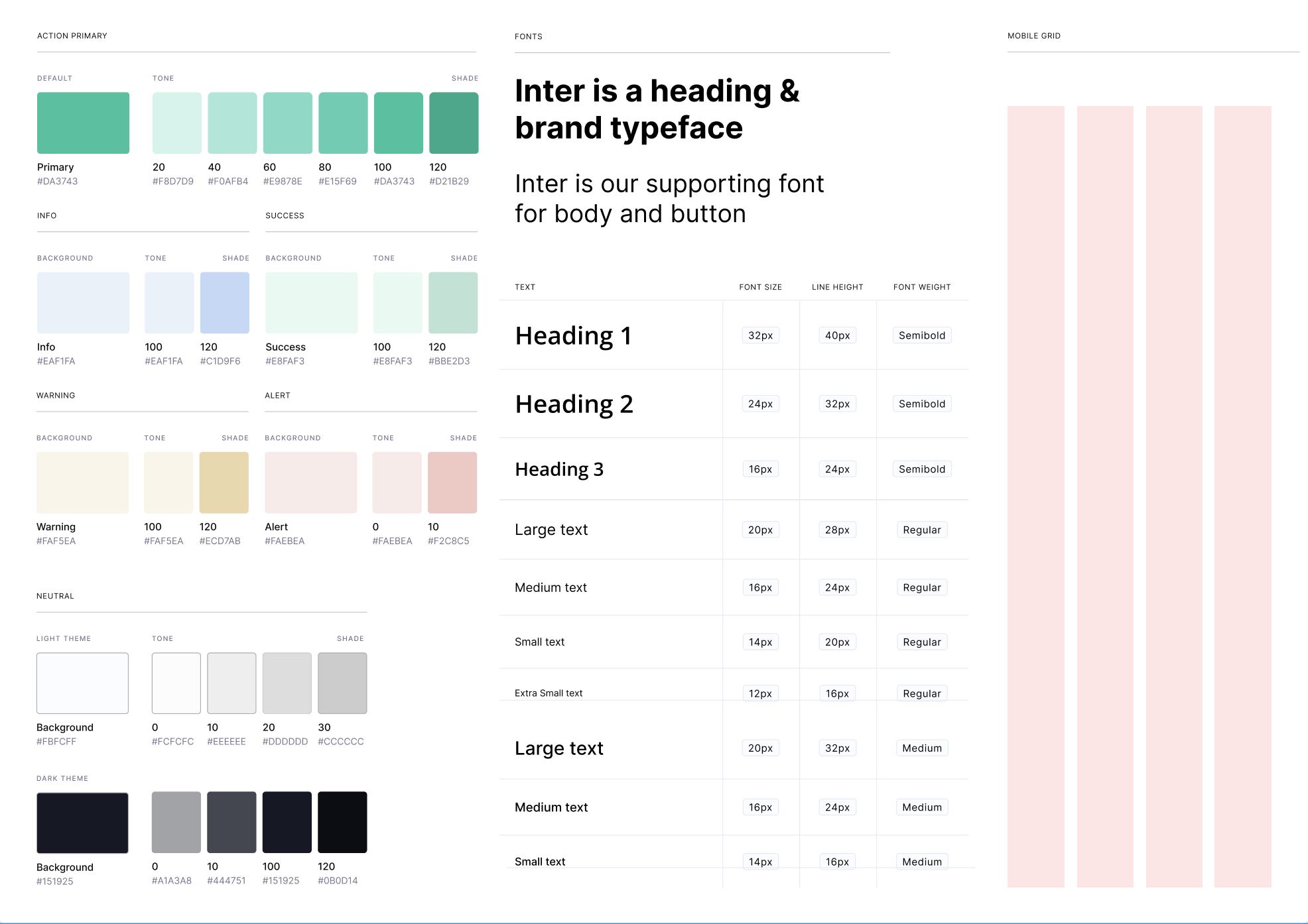
The development of styles and components facilitated the creation of hi-fidelity prototypes, enabling early detection and resolution of potential issues while enhancing efficiency through the reuse of design elements. This approach contributed to improved prototyping quality and accelerated the overall design process.
Hi-fidelity
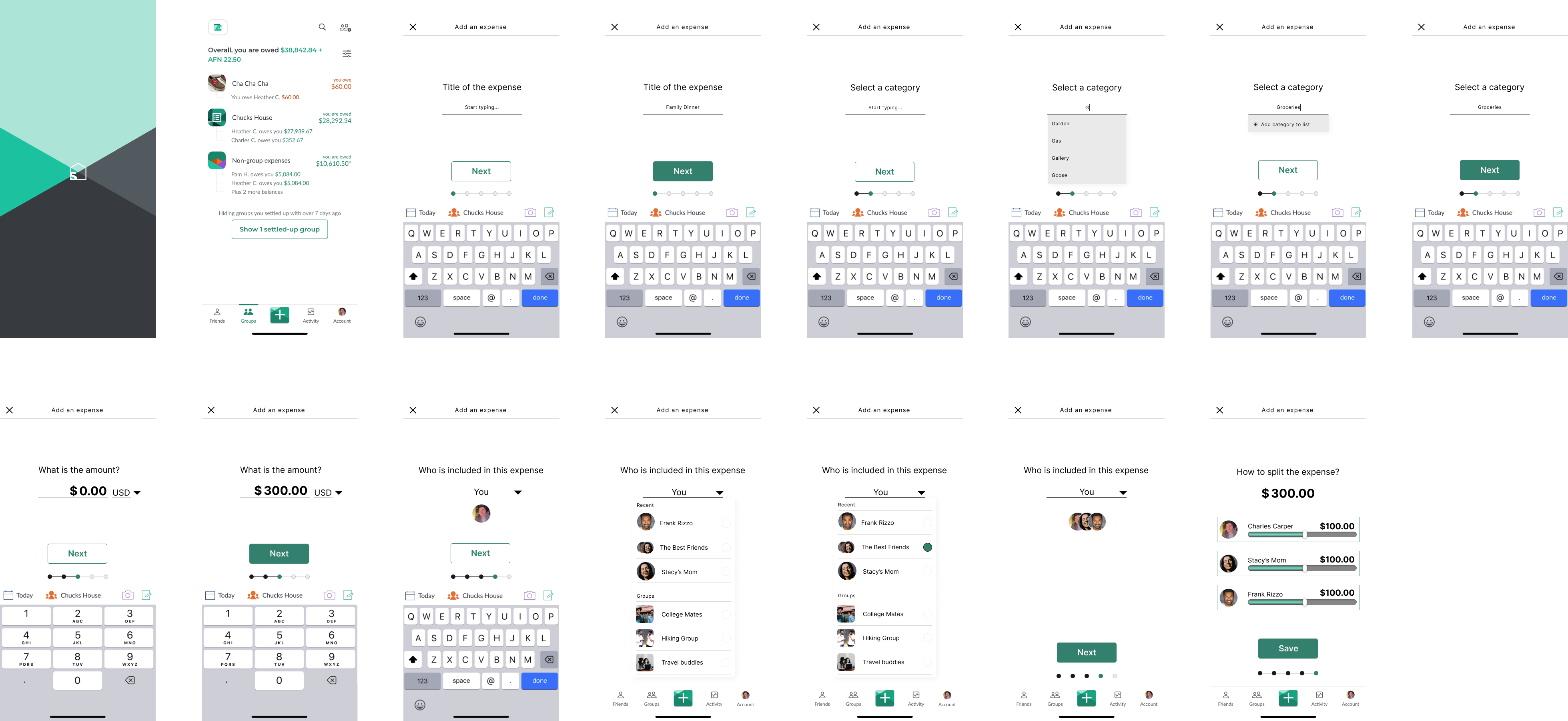
creating a high-fidelity prototype offers a more realistic and visually comprehensive representation of the product, showcasing the layout and incorporating animations and clickable interactions. This enables efficient testing and validation of the product's functionality, providing valuable insights into user experience and ensuring the design aligns with expectations.
Prototype
Usability test
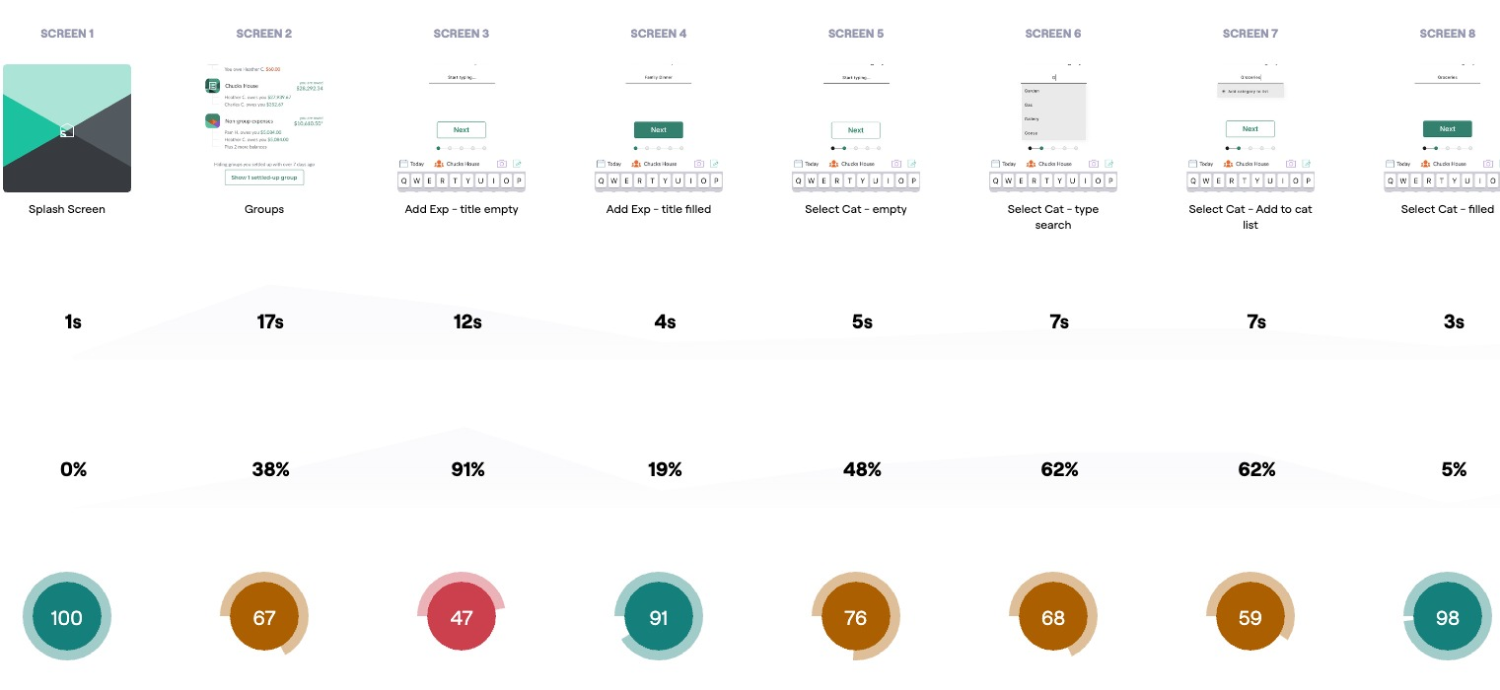
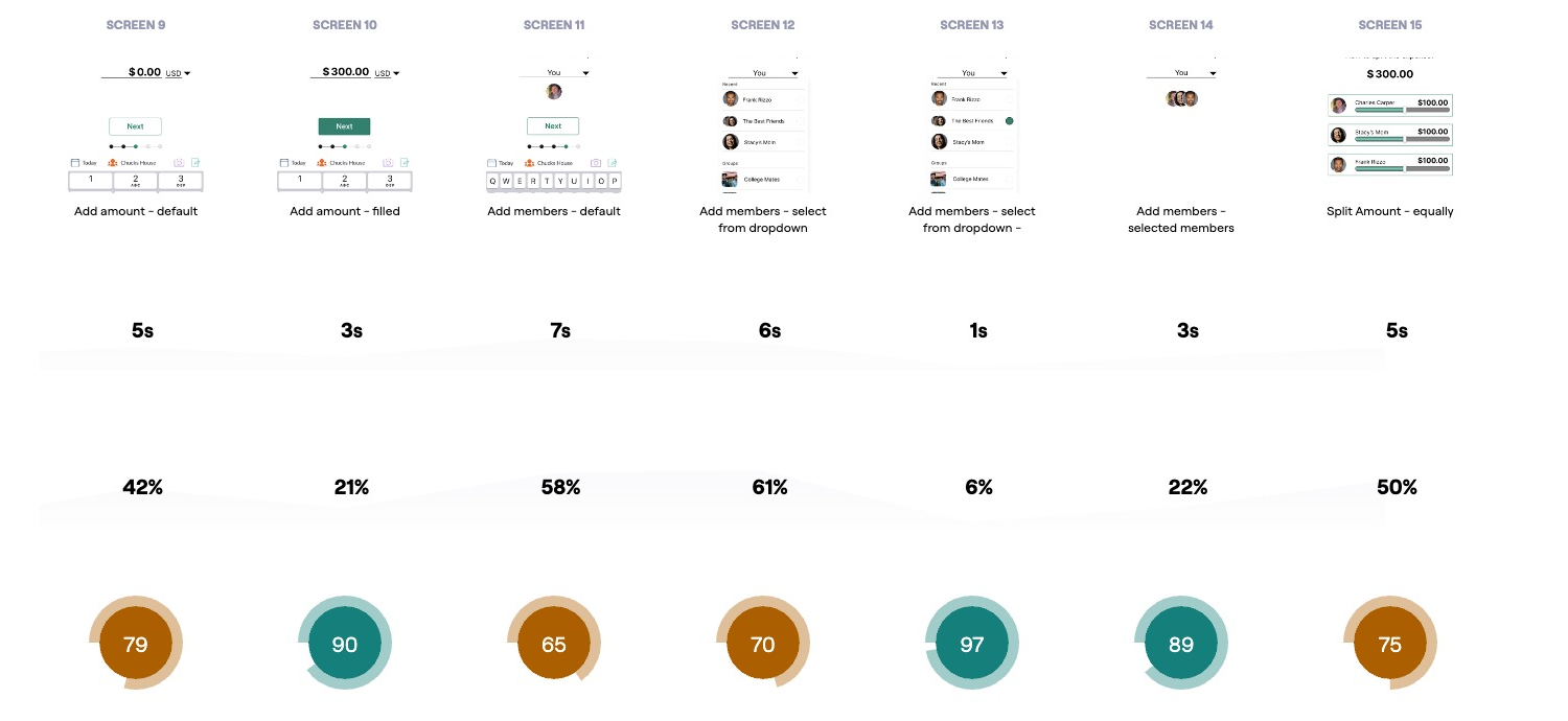
I conducted an unmoderated usability test using Maze.co to validate my design and assumptions. The test script comprised different scenarios and tasks, allowing users to interact with the prototype and provide valuable feedback on its usability and effectiveness.

Test Outcomes
I conducted an unmoderated usability test using Maze.co to validate my design and assumptions. The test script comprised different scenarios and tasks, allowing users to interact with the prototype and provide valuable feedback on its usability and effectiveness.
Three key learnings
- One
- Two
- Three
Next Steps
I conducted an unmoderated usability test using Maze.co to validate my design and assumptions. The test script comprised different scenarios and tasks, allowing users to interact with the prototype and provide valuable feedback on its usability and effectiveness.
